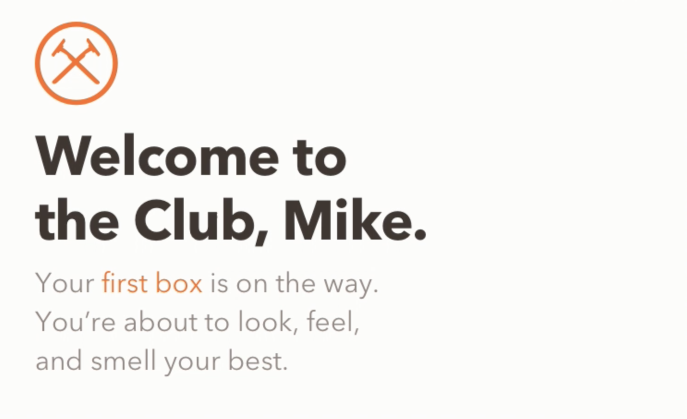
Dollar Shave Club Mobile App Homepage
About half a year into my time at DSC, the Executive team tasked the company with a complete overhaul of the business model. Dollar Shave Club was no longer just a razor subscription service, but a full service grooming membership with shower, haircare, skincare and oral verticals. The problem we discovered was that members were not engaging with the new grooming products and sales were too low. This new member model, which we hypothesized would encourage grooming product sales, meant a complete redesign of our digital experience at every touch point. We designed mobile first, starting with the homepage of our native app.
Objectives for the homepage
Increase sales of the new grooming products
Display users’ box contents
Add new products to your box on the fly, easily and automatically
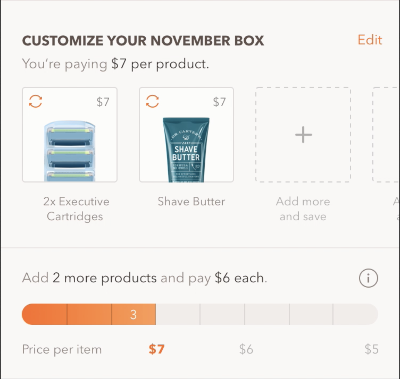
Communicate our new “Buy More Save More” pricing model
Encourage and set up recurring shipments of individual products
Change the way customers viewed DSC
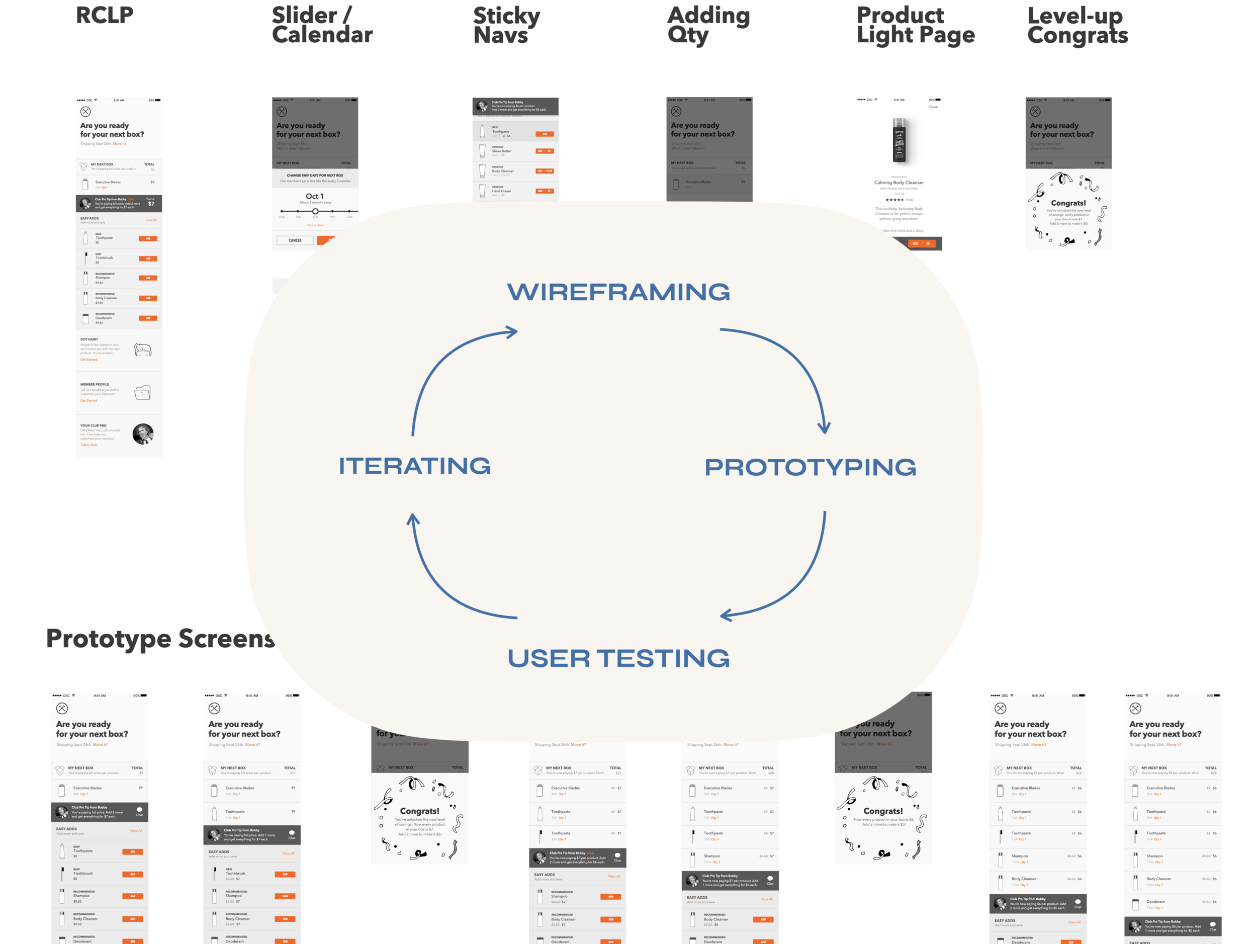
Process
Every designer worked closely with a Product Owner, and collaborated with stakeholders from Business Development, Engineering, and Executive Leadership on any given pricing model that was being proposed.
Then we would each come up with a design concept for the homepage, wireframe it, create low fidelity prototypes, and work with a user researcher using the prototype to gauge comprehension and usability. Then we would iterate based on feedback from users and stakeholders, rinse and repeat until we landed on the most compelling concept, narrowing the versions down based on enthusiastic consensus. We probably had about 15 different concepts we battle tested in a few short weeks.
After narrowing down the concepts, we moved into high fidelity prototypes and continued to iterate using the same vetting process, until finally we had a winner.
The Evolution
The videos below exemplify the evolution between iterations of the DSC app homepage. To the left is a version we almost launched with. To the right is the final version we launched with after user testing the previous iteration.
Design Decisions
Every pixel of screen real estate of the app homepage above the fold was essential. We changed the header, so that instead of marketing language, the header spoke to what users in our testing said they wanted, the ship date of their next box. We replaced the subtext of the headline to highlight what we, as a business, wanted from our customers, which was the upsell.
We changed the box contents so that you could see all your items without having to scroll. We also used this grid itself to elucidate the “Buy More Save More Model” instead of the thermometer style infographic, which users reported was confusing. We also changed the easy add button from the grey add icon and dotted outline tile to a more enticing and seductive orange floating button that would draw the eye.
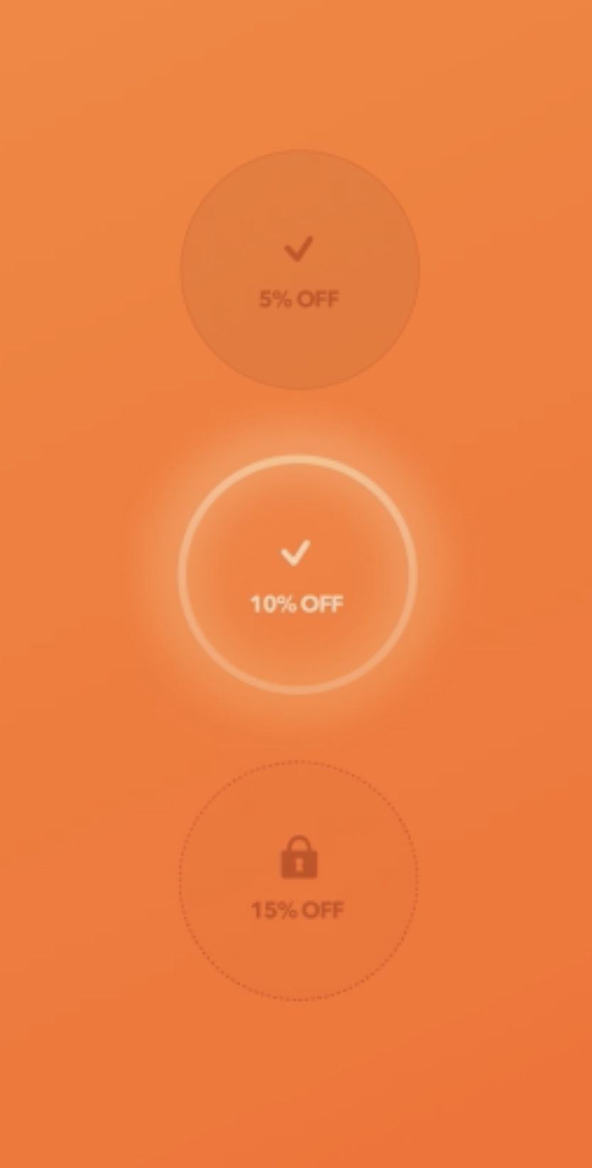
While we kept the this congratulations overlay, we changed the design to include a visualization of all three pricing tiers instead of the just the one you had leveled up to. In this way, we could use this screen to further clarify the overall pricing model.


A note on User Research
While we did perform a lot of usability testing during this design process, we also relied on our broader user research we had already completed. This included our user personas and our customer journey maps. This research formed the foundation of our strategy and helped us negotiate user centeredness with our business goals.
