Paintzen Quote Flow
The vision of Paintzen was an on-demand home painting service with online quoting and booking. A customer could input the details of a paint job they wish to have completed in the online quoting flow, book from there, and have painters arrive at their doorstep at a scheduled time. This quoting flow evolved over time as we discovered problems and opportunities for improvement. As our Senior Product Designer and Creative Director at Paintzen, I worked closely with the CTO, a Product Manager, and Engineer to mature the quote flow, which was the bread and butter of the user experience.
Initial Flow
Below is the flow we began with when I joined Paintzen. Paintzen had been my client when I was at Red Antler, so I developed this user experience when I worked with them initially. Once I joined Paintzen full time, I learned how the UX would need to evolve to solve for new problems.
Hypothesis
The Problem
The first problem we had was that there were too many unqualified leads (with low intent to book) for inbound sales team. At this stage of Paintzen’s development, we had not yet achieved the ability to book online and sales would be picked up by the sales team to complete.
I hypothesized that this was because people had to go through the whole flow just to see how much the job would cost, so users who were just curious were being treated like high-intent leads. So I proposed that we show real-time pricing as early as possible in the flow.
The first A/B test
We ran an A/B test, 50/50 split for 12 weeks. In one version, we revealed the quote after the lead autoresponder email was sent, at the end of the flow. In the other version, we revealed the quote upfront, when the user was selecting rooms, with real-time pricing.
The Result
We found that by revealing the quote before the lead autoresponder email was sent, we had decrease in lead generation but an increase in the booking conversion rate. The inbound sales team was able to spend less time trying to reach out to unqualified leads and more time up-selling the qualified leads resulting in a slight bump to average revenue per job.
Hypothesis
The Problem
The next problem we had was that without full customization, inaccurate quotes would need to be adjusted over phone before booking. This meant problematic friction at our main point of conversion.
I proposed a rather contentious solution of adding more steps to the quote flow to gather paint details on a per room basis. Of course by adding complexity to our funnel we risked increasing the cognitive load of users, and thus the abandonment rate. I hypothesized however, that for such a high-priced purchase, inputting more details during the quote flow might increase the confidence in the final quote.
The second A/B test
We ran another A/B test, 50/50 split for 12 weeks. I designed a version where surfaces to paint, room size, and ceiling height were all selected on a per room basis and we tested that against our current flow.
The Result
Ultimately we found users who completed the new, more complex flow required fewer price adjustments before booking and the average revenue per job increased by a noticeable amount. Furthermore, the drop off that we anticipated proved to be lower than we thought.
Hypothesis
The Problem
The final problem was that the room size illustrations were, I suspected, a bit too abstract and were leading to inaccurate sizing and thus pricing, creating problems for both painters and customers.
I proposed a new isometric (Sims style) illustration approach and designed new illustrations to test out.
Illustration Survey
Another A/B test would mean we would need to have 30 new room size illustrations, plus consistent isometric illustrations for the rest of the flow before we had even validated the need for this change. Instead, we ran a survey with 50 people that lasted two weeks. We had survey participants select their bedroom size based off both illustration styles and then record their actual room dimensions to evaluate accuracy.
The Result
With the results of the survey, participants reported that they were more comfortable with isometric illustrations and those selections proved to be more accurate when comparing to final measurements. So I created all new illustrations for both the quote flow and the rest of the marketing site. I also found that the new illustration style offered lots of opportunity for delight. Many of our users were interior design aficionados and this illustration style afforded me the ability to plant easter eggs in the rooms, like famous Eames chairs or Matisse paintings on the walls.
The new and improved quote flow
Below is a prototype of the flow with these new improvements, with all new illustrations and a different overall style. I really enjoyed this incremental user focused, problem by problem approach to building out and developing this user experience. It allowed me to tackle a key conversion funnel in a focused and iterative way.
A Final Note
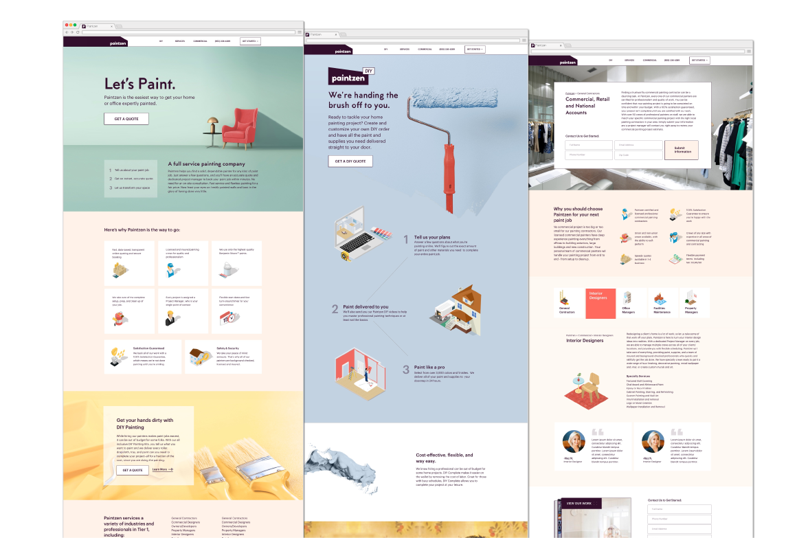
The overall look and feel of Paintzen changed under my creative direction.
A New Vision
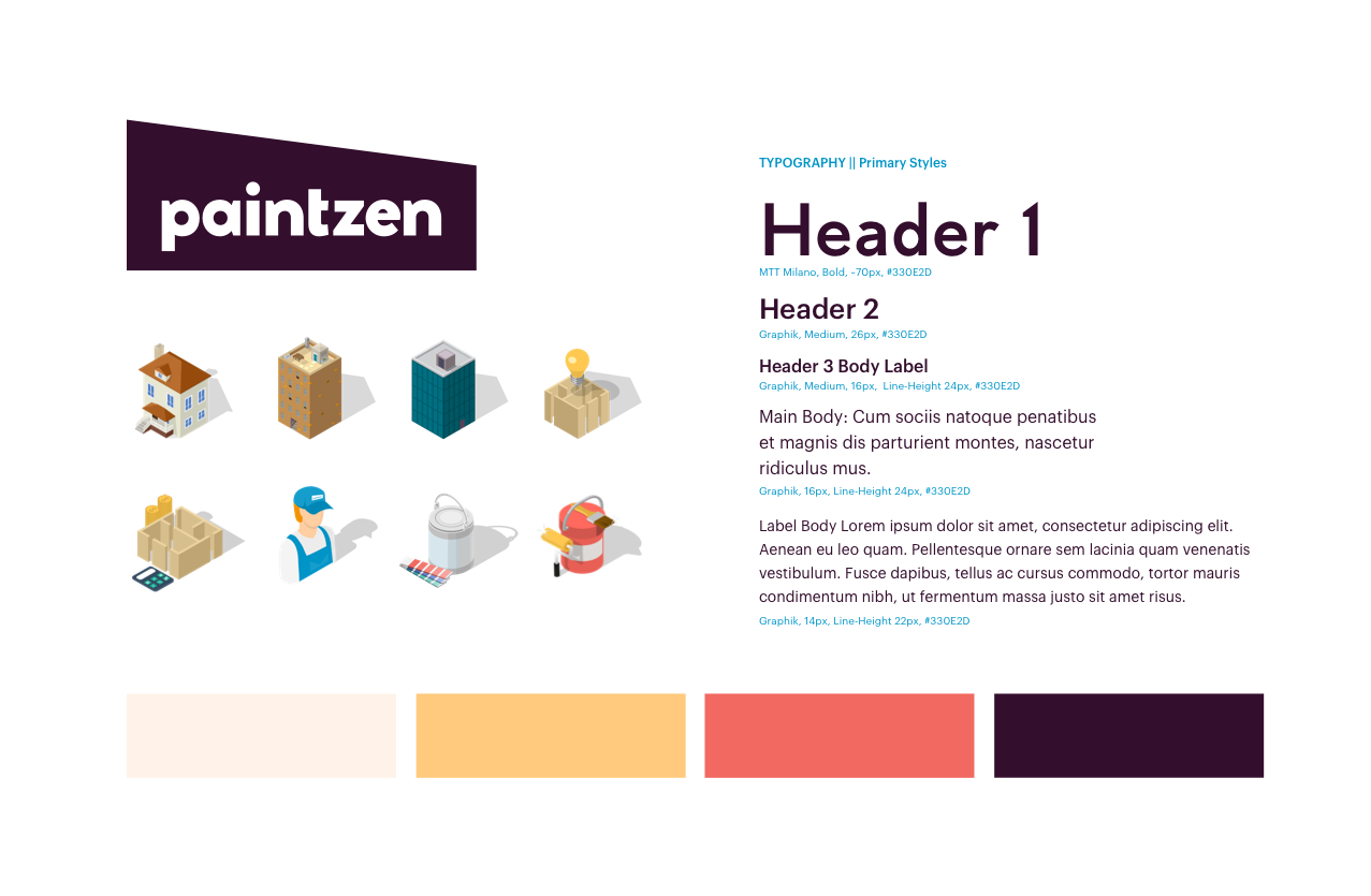
As the principal designer at Paintzen, I was in charge of all marketing design and social imagery, in addition to our digital design. Our initial color palette, with its bright poppy colors, proved to be very challenging to put into practice. It was nearly impossible to find images of beautiful, aspirational walls that didn’t clash with those colors. We needed to function more like a fashion house, with a logo that was much more neutral (white or black-purple) so that it would compliment different wall colors and seasonal palettes we’d be showcasing.
We also launched a new product, Paintzen DIY, which allowed customers to purchase the supplies for their paint jobs without paying for the cost of labor. So the branding evolved to accommodate the younger, more aesthetically driven audience that DIY appealed to.


